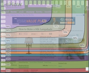
With all the online business dudes hangin’ about, it got me thinking about traditional internet marketing advice…
Advice like “put your opt-in above the fold”.
Last week, I watched a Marketing Show episode where Clay Collins suggested that someone put their opt-in box above the fold.
Sometimes, it’s great advice.
Many people follow it. It’s practically a cliche to say “put your opt-in box above-the-fold”.
Given this, I was surprised to discover a fascinating blog post on the Marketing Experiments blog that flew in the fact of this “above-the-fold” advice.
The blog post – Nonprofit Marketing: How a long, ugly page generated 274% more revenue
The big takeaway –
How a long, ugly page generated 274% more revenue… with the opt-in AT THE BOTTOM OF THE PAGE!
What would Clay Collins think?
You can read the full study at the link above… but here’s the summary.
“The control page (the original, un-optimized page) was a typical two-column layout where the call-to-action (CTA) begins above the fold. It followed standard internet marketing protocol, given by mainstream blogs all over the net… It was a good-looking page with a clean design.”
“The treatment page (the new, optimized page) not only buried the call-to-action below the fold, it also added long-form copy to provide the readers with more value. The result was a, “long, ugly page,” in the words of Tim Kachuriak.”
The results?
If they had to guess, most people would pick the first page as the top-converting page… because it looked better and had the opt-in box above the fold.
But the reality was much different…
The treatment page resulted in:
- 74% Increase in Donor Conversion Rate
- 189% Increase in Average Gift
- 274% Increase in Revenue
In other words, the ugly page with long copy and the opt-in box at the bottom generated 274% MORE REVENUE than the pretty page that had the opt-in box above the fold.
Does this mean above-the-fold is bad?
Nope.
Like all marketing, this comes back to understanding your audience.
If they are a fresh visitor from an advertisement or search engine with no knowledge or your brand, they’re not going to give you their email address…
You’re gonna have to win them over.
The golden advice from the Marketing Experiments post that most people ignore –
“It has everything to do with providing the CTA in the correct place in the thought sequence.“
The “thought sequence”… doesn’t that sound cool?
Rather than shoving your opt-in box at the top of the page, it forces you to put yourself in your visitor’s shoes and understand them. You’re forced to figure out what your visitor is actually thinking about and what would make him opt-in… And if you take the time to figure this stuff out, you’ll see an instant boost in landing page conversions.
Take a look at your landing page. Are you asking people to opt-in to your list before they’re convinced they like you? Are you asking your visitor to take an action before they have decided they trust you?
If so… you could see an instant boost in conversions by placing your call-to-action in the right location in your copy, even if that means putting it at the bottom of the page.
This is also another hit to the “short copy wins” folks 🙂
You can apply this to your email opt-in landing pages as well as your sales pages.
Get it?
Don’t ask people to take a specific action before they’re ready to take action. You have to lead them to the action.

I totally agree with the all questions you raised. Thanks for the info, super helpful. Just look at the service
https://goo.gl/OQdRbw. Its pretty easy to use. I think you can get a free trial if you ask for it.